THE INTREPID FOUNDATION
Branding, report design, social posts, appeals and campaigns
Case study BRANDING THE INTREPID FOUNDATION
Conceptual Approach
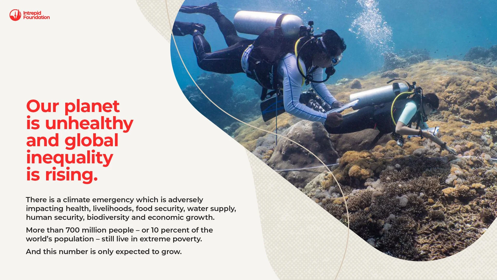
The visual identity and report design for The Intrepid Foundation centred on a core idea: the Foundation as the connective thread woven through Intrepid’s purpose. A continuous line runs through the report, symbolising connection, movement, and meaningful impact. It works both literally and metaphorically — linking people, communities, and causes across the globe. This thread acts as a visual anchor, flowing across each page just as the Foundation’s work reaches far and wide.
Visual Language
To support the thread, I designed a series of organic shapes inspired by continents, islands, and landmasses. These forms reflect the Foundation’s global presence and diverse community, while reinforcing a sense of unity and collaboration.
I also introduced a colour-coded system to highlight the Foundation’s four key impact areas. This allows readers to quickly identify and group related stories, keeping the areas of impact central to the narrative throughout.
Evolution
For the 2024 report, the visual language evolved while staying true to the original concept. The refreshed design brings more clarity and confidence, with the thread continuing to guide readers and connect stories — a reminder of the Foundation’s ongoing work around the world.


I created motion graphics and crafted typography in After effects to support the video created by the video team.
Snippets from the most recent Impact report